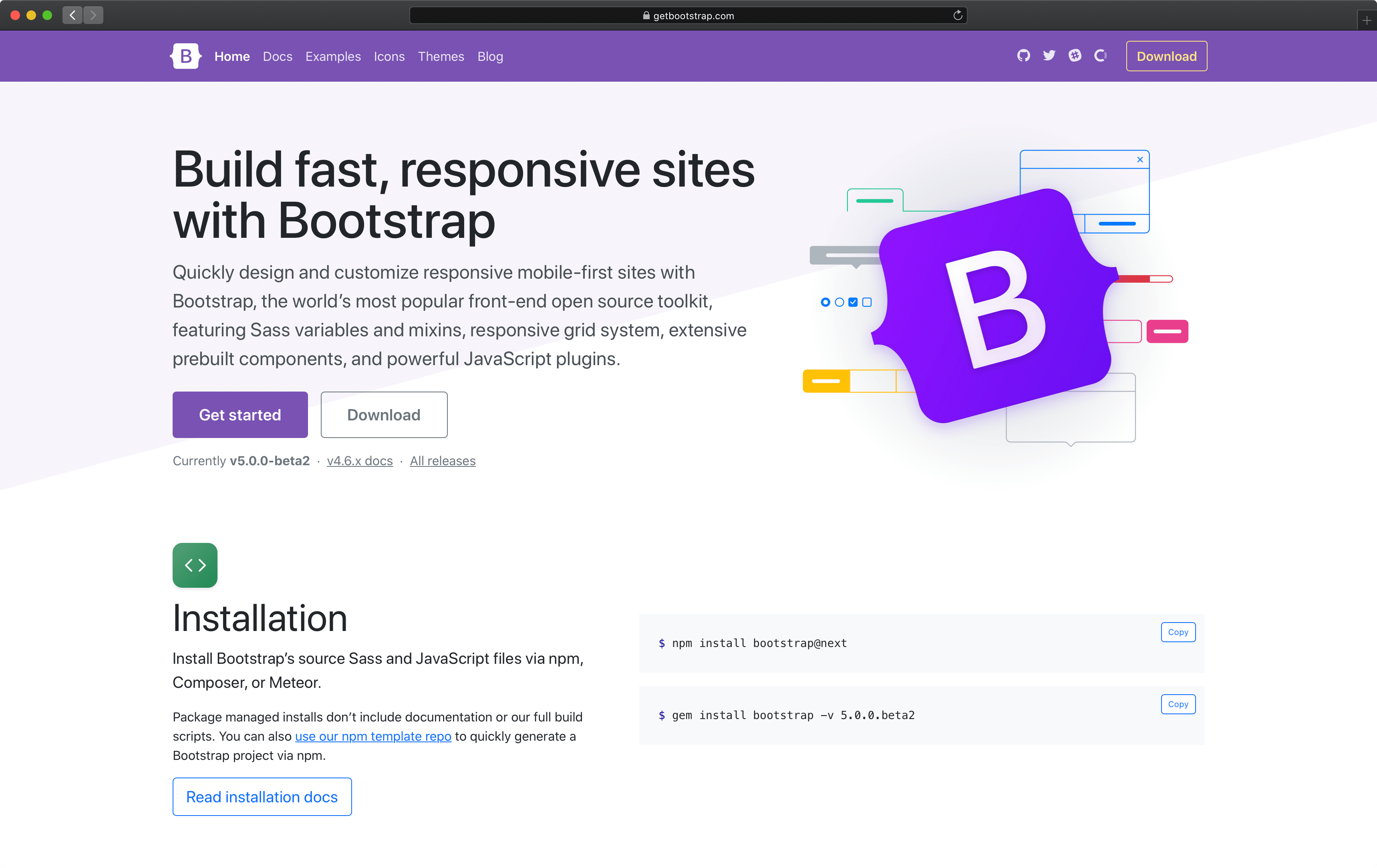
Centered screenshot
Quickly design and customize responsive mobile-first sites with Bootstrap, the world’s most popular front-end open source toolkit, featuring Sass variables and mixins, responsive grid system, extensive prebuilt components, and powerful JavaScript plugins.

First featurette heading. It’ll blow your mind.
Some great placeholder content for the first featurette here. Imagine some exciting prose here.
Oh yeah, it’s that good. See for yourself.
Another featurette? Of course. More placeholder content here to give you an idea of how this layout would work with some actual real-world content in place.
Heading
Some representative placeholder content for the three columns of text below the carousel. This is the first column.
Heading
Another exciting bit of representative placeholder content. This time, we've moved on to the second column.
And lastly, this one. Checkmate.
And yes, this is the last block of representative placeholder content. Again, not really intended to be actually read, simply here to give you a better view of what this would look like with some actual content. Your content.